|
“Lauren Owen's actions, creations, and suggestions have resulted in considerable growth for Metta. She had a deep understanding of the people using our product, and her reports and designs were clear and actionable.”
Vince Favilla Supervisor Metta |
SpaceLab
|
|
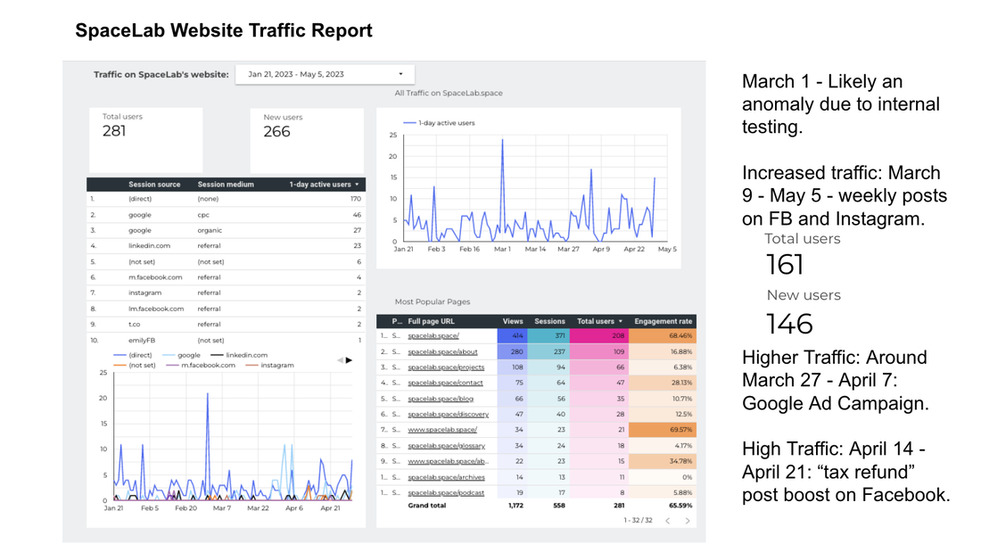
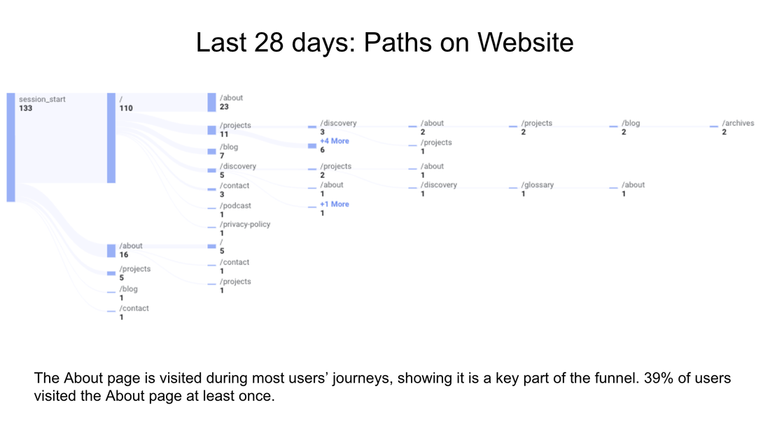
- I installed and leveraged Google Analytics 4 data to predict what was effective in our social media, ads, and website. Also worked with cross functional team to implement advanced tracking for conversion events on the website.
- Managed marketing team, and co-created marketing materials, leveraging creative commons, AI, and partnerships with creatives.
- Tools: Presentations · Management · Google Analytics 4 · Google Tag Manager · A/B/Multivariate Testing · Cookies · Digital Marketing
Progress Residential
|
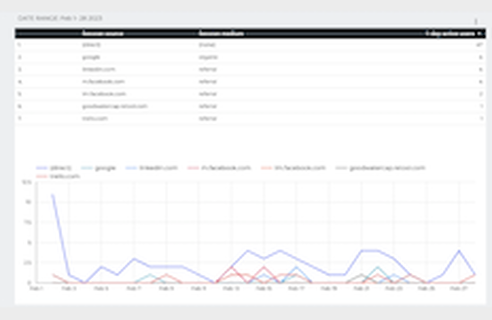
● Surfaced useful information from analytics tools in order to increase conversion, engagement, and enhance user experience. ● Used Google Analytics, Adobe Analytics, Looker, and Fullstory to deliver exceptional UX and analytics insights. ● Created reports, such as pathing reports, custom Key Performance Indicators (KPIs) and engagement metrics. ● Created new types of reports: such as a geolocation map view of search terms to better understand what was hot across the United States. ● Provided UX re-write for the How-To on the website. ● Recommendations for outline of funnel redesign for conversion. |
Baynote/Kibo
|
|
Web Analysis work was performed on a daily basis at Baynote.
"Lauren works tirelessly to manually tweak recommendation quality over all our customer sites and provided valuable feedback to the engineering team in terms of tuning our algorithms. She shows an exceptional understanding of the mechanics and trade offs involved in our often highly mathematical models of user behavior."
Team Member
Baynote/Kibo
(Full recommendation viewable on Linkedin)
Team Member
Baynote/Kibo
(Full recommendation viewable on Linkedin)
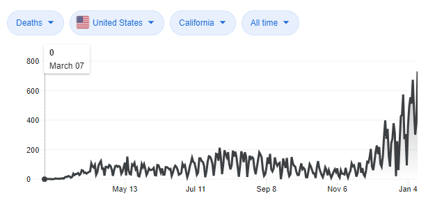
Data Analysis for Covid-19
Google had very jagged data for Covid-19 deaths:
So, I created a graph of a rolling 7-day average.
The lighter, orange numbers below, show the upward trend. This helped me predict what the virus numbers might be doing the following week.
The lighter, orange numbers below, show the upward trend. This helped me predict what the virus numbers might be doing the following week.
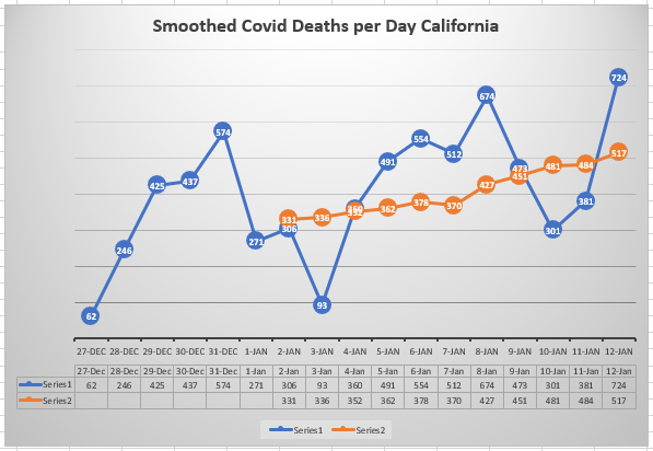
About a week later, Google started doing the same rolling 7 day average, indicating this is easier to understand for most people.
Metta

|
|
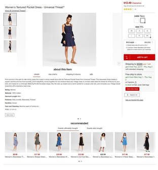
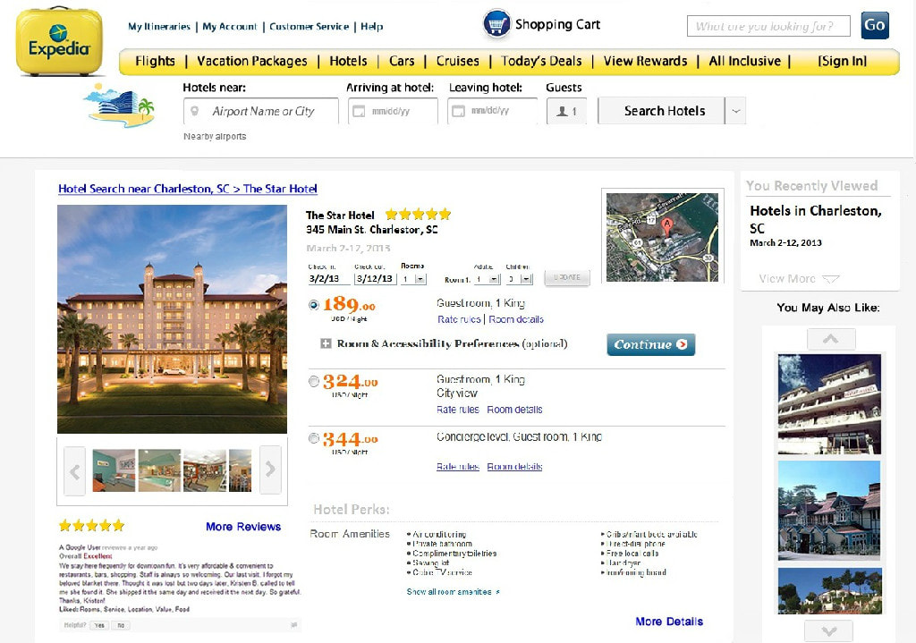
Expedia
(Speculative Redesign through UC San Diego Program)
|
In my redesign:
|
Appetitely Survey
- Problem: Appetitely (a small start-up fictional company modeled after popular meal-kit-delivery companies such as HungryRoot) has users unsubscribing from their paid service everyday.
- Research Question: Why do people unsubscribe from Appetitely? What are the top specific things, by rank, that cause this among users canceling the service?
- Method: As each customer cancels, they will see this survey prompt immediately. Survey will be given to every user that cancels over a 14 day period.
Call to action designed to get more responses, based on research data:

Survey Design:
- A larger text box for open-ended question answers encourages more detailed response.
- Answers are NOT forced/required so that we can receive more data.
- Likert Scales (degrees of satisfaction) are balanced, and questions are designed for clarity and non-bias.
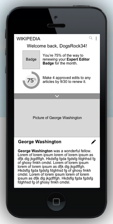
Wikipedia
|
This project was conducted through Cooper's UX Certification Program in partnership with Wikipedia, and leveraging a group of recruited target market individuals.
Goal: Wikipedia desired more volunteer hours, and wanted to re-design their mobile app. My Method:
|
|
Visualization Projects in Tableau
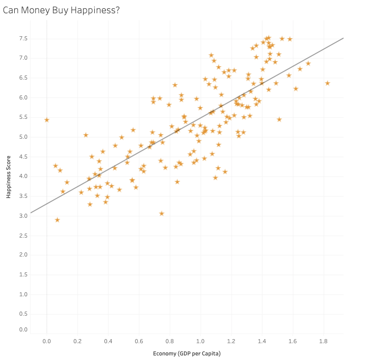
The correlation coefficient is 0.78 (1 being the highest). It's highly correlated.


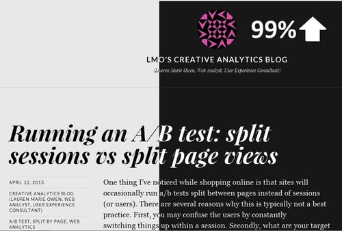
Blog